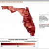
 The work of Extension professionals is often to translate complex research findings into practical recommendations. One of the tools used for communicating with Extension audiences is visual representation of data. These visualizations include graphs, charts, and data overlaid onto maps. Just as text and words must be thoughtfully prepared for broad understanding, images should be adapted from the forms used with highly knowledgeable audiences. This 6-page fact sheet summarizes research in science communication and education that offers strategic ways for communicators to revise data visualizations for broad meaning-making. Written by Kathryn Stofer, and published by the UF Department of Agricultural Education and Communication, May 2014.
http://edis.ifas.ufl.edu/wc163